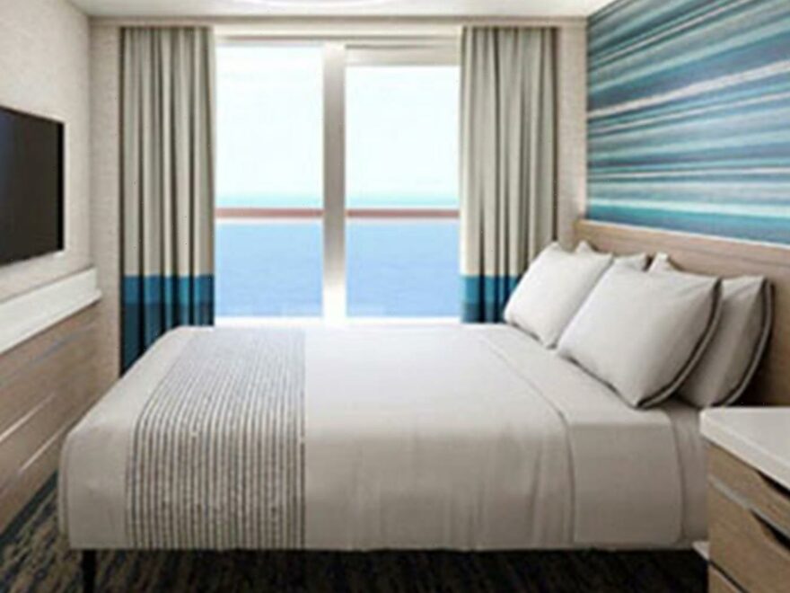
WITH cruise lines like Carnival building bigger and bigger ships, more and more passengers will be crammed onto one vessel.
And with so many cabins on one ship, it can be very hard to keep it from feeling cramped.
That's why the design for the cabin, or stateroom as they're known, is more important than ever – because guests won't book and keep coming back if they don't enjoy their stay.
Fortunately for guests and cruise lines, designers have some clever tricks that they use to make cruise ship cabins look and feel bigger – even if they're not actually.
Ahead of its new 5,200 passenger ship's launch, Carnival has revealed some of the design features on Mardi Gras – and you could use these tricks at home as well.
1. Getting rid of bedside tables
With space at a premium, the bedside table is one of the first things to go.
Instead, the new staterooms, created by UK's DCA Design International, features two shelves mounted to the wall on either side of the bed.
It means that guests will still have somewhere to put their stuff – a phone or a glass of water for example – but it doesn't take up much space.
Plus, you can put stuff underneath it, like your shoes or slippers.
What's more, according to Carnival, getting rid of the bedside tables meant a bit more room for the bathroom.
2. Double use furniture
There is no coffee table in front of the sofa.
Instead, there's an ottoman with lid that opens up to offer more storage space.
And if you need somewhere to put your drinks, just flip over the lid and you'll find a little tray.
The sofa itself also "flips" into a twin-sized bed – you just turn it over with a handle.
3. Use curves
Another design feature was the addition of curves where possible.
The most obvious place is the bathroom – it's curved rather than at a right angle to make the area feel more spacious.
Another design feature in the bathroom is the shower door.
This slides in to one side rather than opening out, which means it doesn't take as much room.
4. Hidden storage
Aside from the ottoman, the wardrobes also feature hidden storage.
There's a pull-out shelf for shoes, and there are separate baskets for your other clothes.
There are even shelves that fold away so you can customise the wardrobe according to how much space you need.
5. More light
One of the easiest ways to increase the feeling of space is to add more light.
Carnival has taken out small spotlights and replaced them with big, round lamps that brighten the cabin.
The lights are also wall-mounted to save space.
The staterooms with balconies also feature floor-to-ceiling glass balcony doors, which slide across to ease of access.
Most read in travel
HOLIDAY HELL Families face airport chaos as Heathrow staff set to strike in half-term hols
Mark Wright reveals the common travel mistake he always makes
I'm a flying expert & I always pick the 'WORST seat' – here's why you should too
Travel update for families as EU changes rules of children travelling abroad
Sun Online Travel previously revealed how airports are designed to get you to spend more money.
And the colour of the floor is designed to help passengers navigate the airport.
We also explain why seating in airport is so uncomfortable.
Source: Read Full Article


