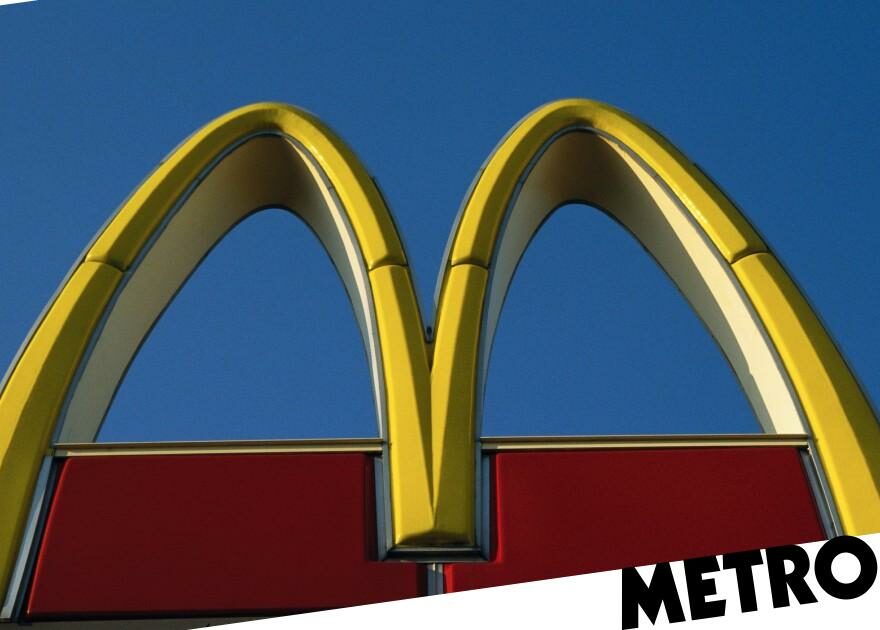
Ever wondered exactly why McDonald’s has its iconic red and yellow logo?
Well apparently, it’s all to do with making us feel happy and hungry.
In a blog post on her website, Karen Haller, an expert in applied colour psychology, explained the powers of suggestion that the colours red and yellow have over us.
Karen, who runs a behavioural design company that’s worked with the likes of Dulux, Dove, and M&S, wrote: ‘Red triggers stimulation, appetite, hunger, it attracts attention.
‘Yellow triggers the feelings of happiness and friendliness.’
If customers are associating an attention-grabbing food brand with feeling hungry and with generally good vibes, then said brand is probably on to a winner.
Karen added: ‘When you combine red and yellow it’s about speed, quickness. In, eat and out again.’
She also pointed out that yellow is the most easily visible colour during the daytime, making the iconic McDonald’s ‘M’ very eye-catching from afar.
Pretty handy for attracting hungry punters.
And Mcdonald’s isn’t the only fast food chain to have incorporated these emotive, eye-grabbing colours into their logos.
Karen includes photos of KFC, Burger King and In-N-Out Burger logos next to the McDonald’s one in her post – all of which feature a lot of red, and three of which also use a lot of yellow.
Ketchup and mustard, anyone?
But times they are a-changing, and Karen said McDonald’s is trying to change with them.
‘You may have noticed that McDonalds are changing a lot of their store colours to green,’ she said. ‘Notice the different feeling this gives. Green elicits the feelings of nature, natural and environmentally friendly.’
No more is the goal just hurrying customers in and out for the speediest of fast food. Now, she argued, it’s about the experience of being able to relax
‘It would be interesting to know if this has attracted a new ‘green’ customer base,’ she went on. ‘One that is more environmentally aware?’
Do you have a story to share?
Get in touch by emailing [email protected].
Source: Read Full Article


